Team: Fei Gao, Soudea Forbes, Collin Aycock, Ayesha Ewing
Tools: Marvelapp, Sketch, Axure, Omnigraffle, Photoshop, Stormboard, Lucidchart
Topic: Class Project -- Introduction to User-Centered Design
Personal Contribution:
- conducted contextual inquiry with 3 users
- participated in creating affinity diagram and personas
- idependently created user journey map, concept analysis diagram and site map
- collaborate with teammates in creating wireframes
- tested the prototype with 2 users
- iterated the design independently
The Problem
Have you encountered these problems while traveling?

Spend a whole night making travel plans

Read the map but still don't know where to go
Miss the event that you've planned to join
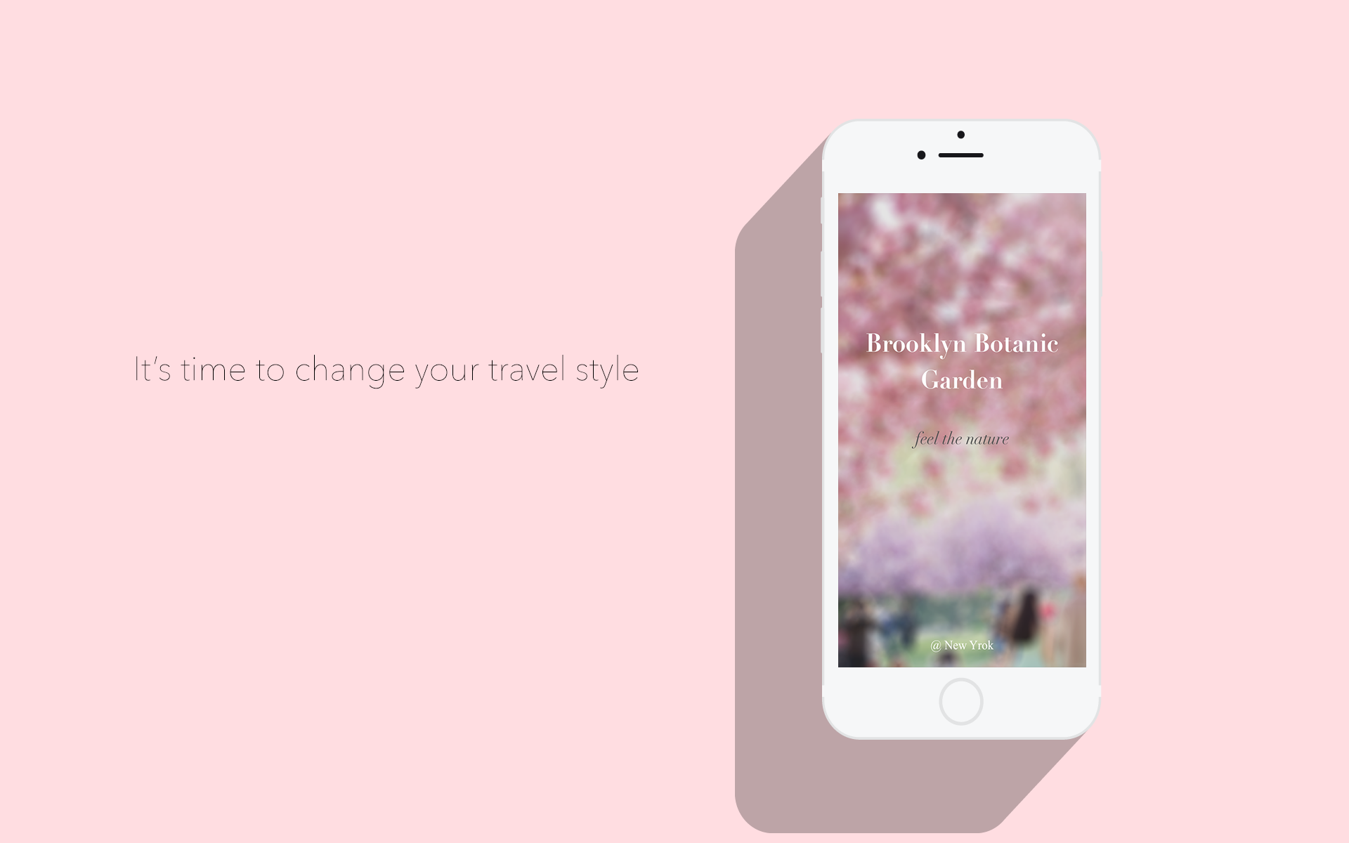
Travel has always been an exciting thing, but on the other hand, it's also troublesome. In this project, our imaginary client is Brooklyn Botanic Garden,
we tried to design an app which solves traverlers' painpoints and enhance the integrated experience for their travel to the Garden.
This project was for the class of Introduction to User-Centered Design. We went through a full UCD process, but didn't dig deep into all the phases.
We based our project upon:
early focus on users and tasks (identify users, study their behavior, attitudes, cognitive and physical characteristics);
empirical measurement(observe, measure, record, and analyze users' reactions and performance with respect to usage scnarios, instructional materials, simulations, and prototypes);
iterative design(follow a design-prototype-evaluate-redesign cycle to address problems found in design evaluations).
Empathize
In empathy mode, we identify target users and the kinds of support an interactive product may provide to them.
We first defined two general user categories -- casual visitors and experienced visitors (members) -- and recruited our participants accordingly for contextual inquiry. We interviewed
8 people in total and took general field notes. After that, each team member translated his notes into observations in Stormboard -- the tool that we used for affinity diagram. From there,
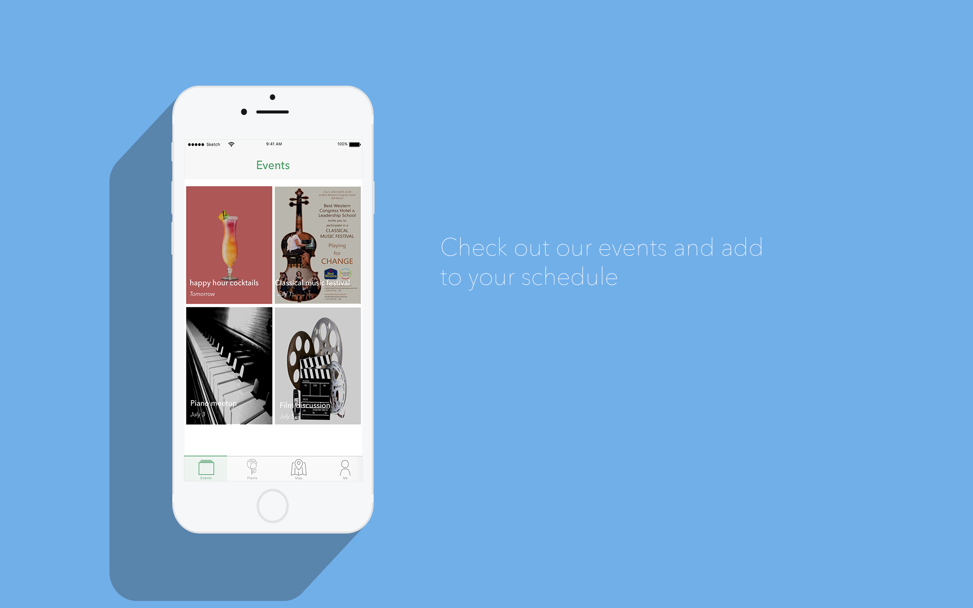
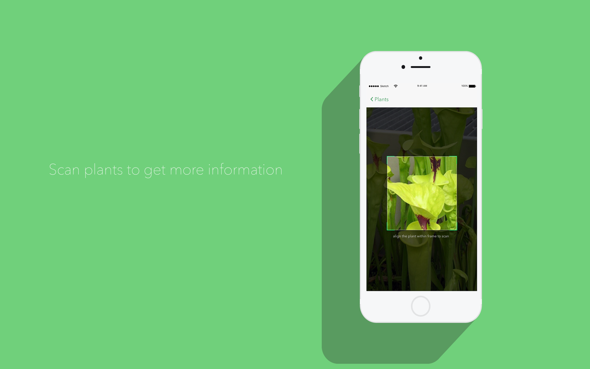
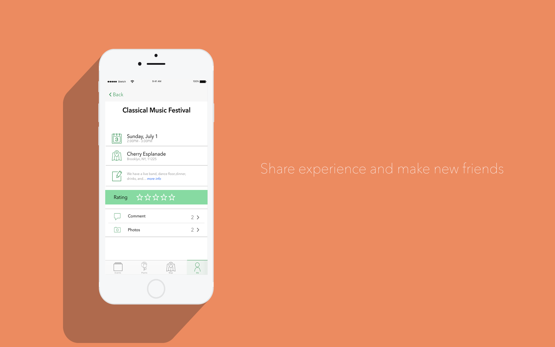
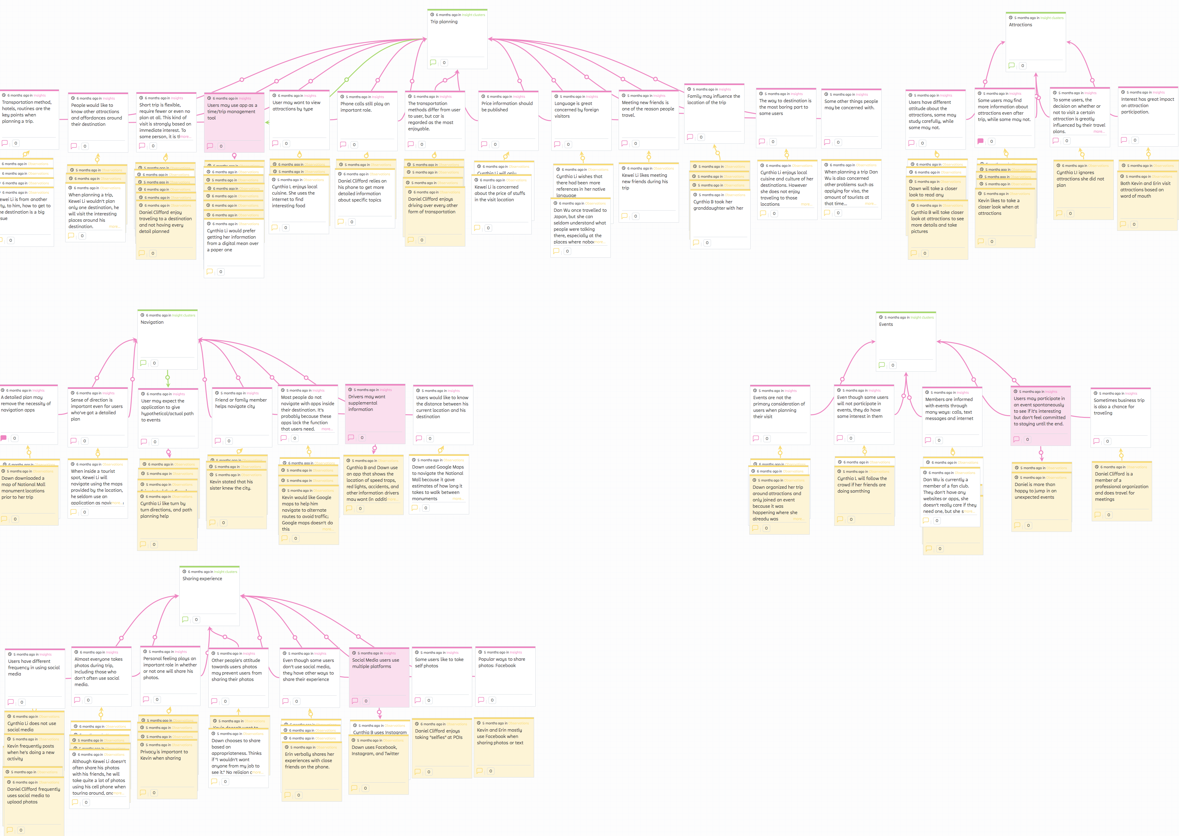
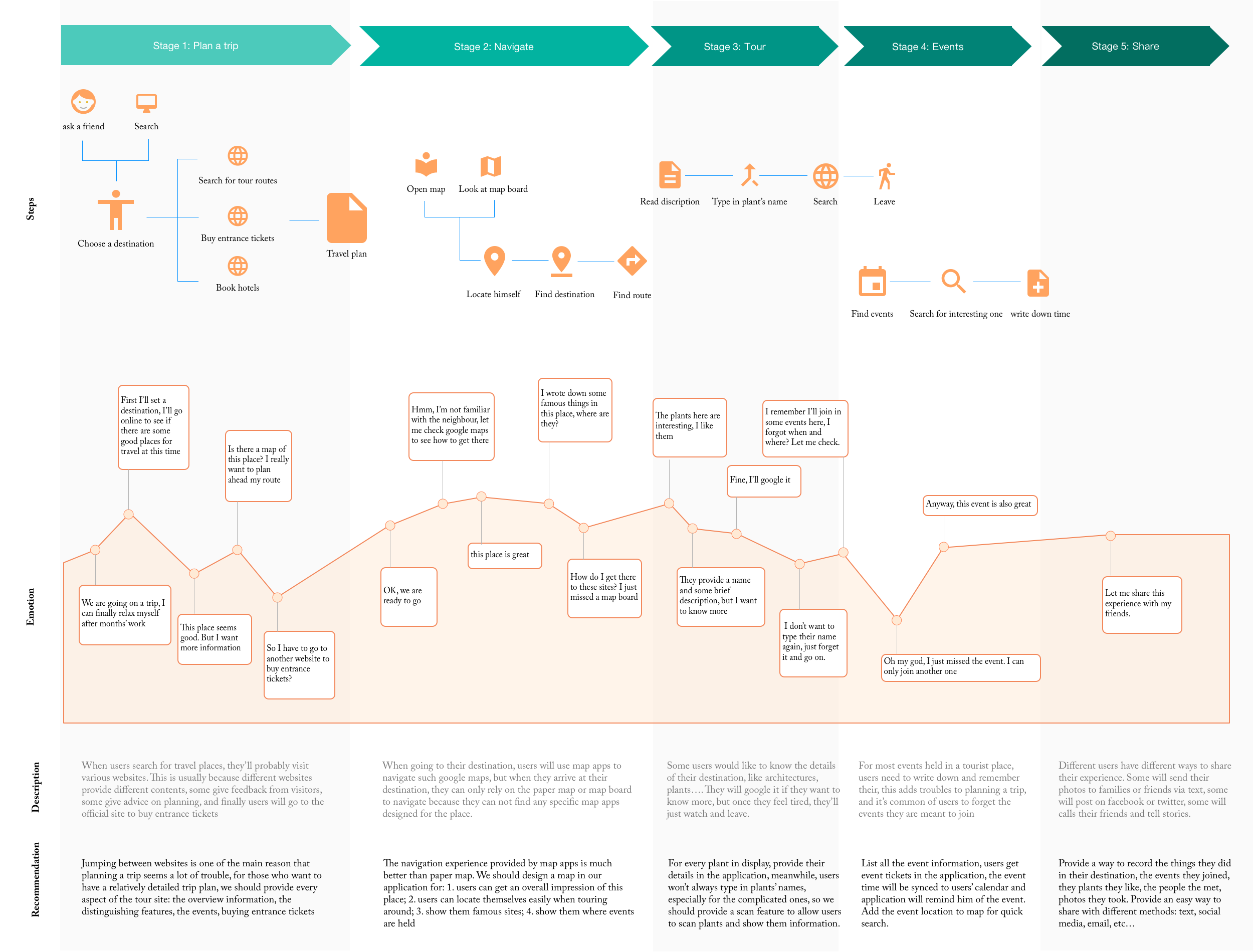
we were able to identify 5 major themes that people were concerned about: trip planning, navigation, attractions, events, sharing experience.
Affinity Diagram
Define
So, how does users' current experience like for traveling in terms of the 5 major themes? In define mode, we use the results of contextual analysis to create
design-informing models and establish requirements.
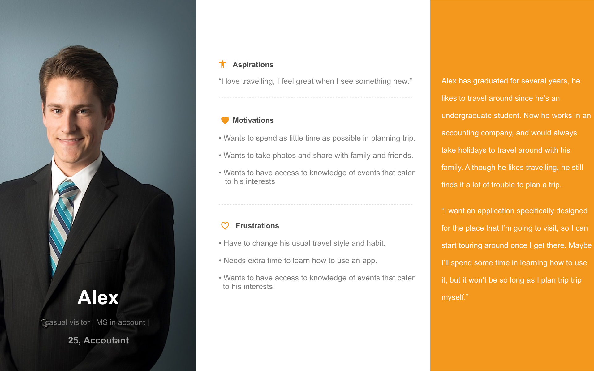
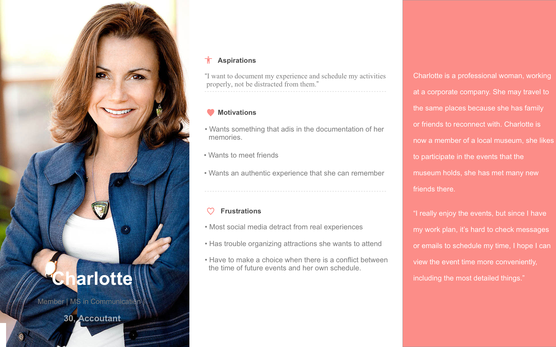
With the data that we collected from the contextual inquiry, we synthesized personas for each user type and created user journey map.
These tools helped us to describe the various goals and behavior patterns among our potential users, as well as further analyze empathy.
Personas
Journey Map
Conceptual Model
Each user has a different mental model of the tool, their mental models are personal, partial, uncertain and dynamic.
As designer, we should abstract our understandings of the task and tool from the activity of all intended users and address the whole task domain.
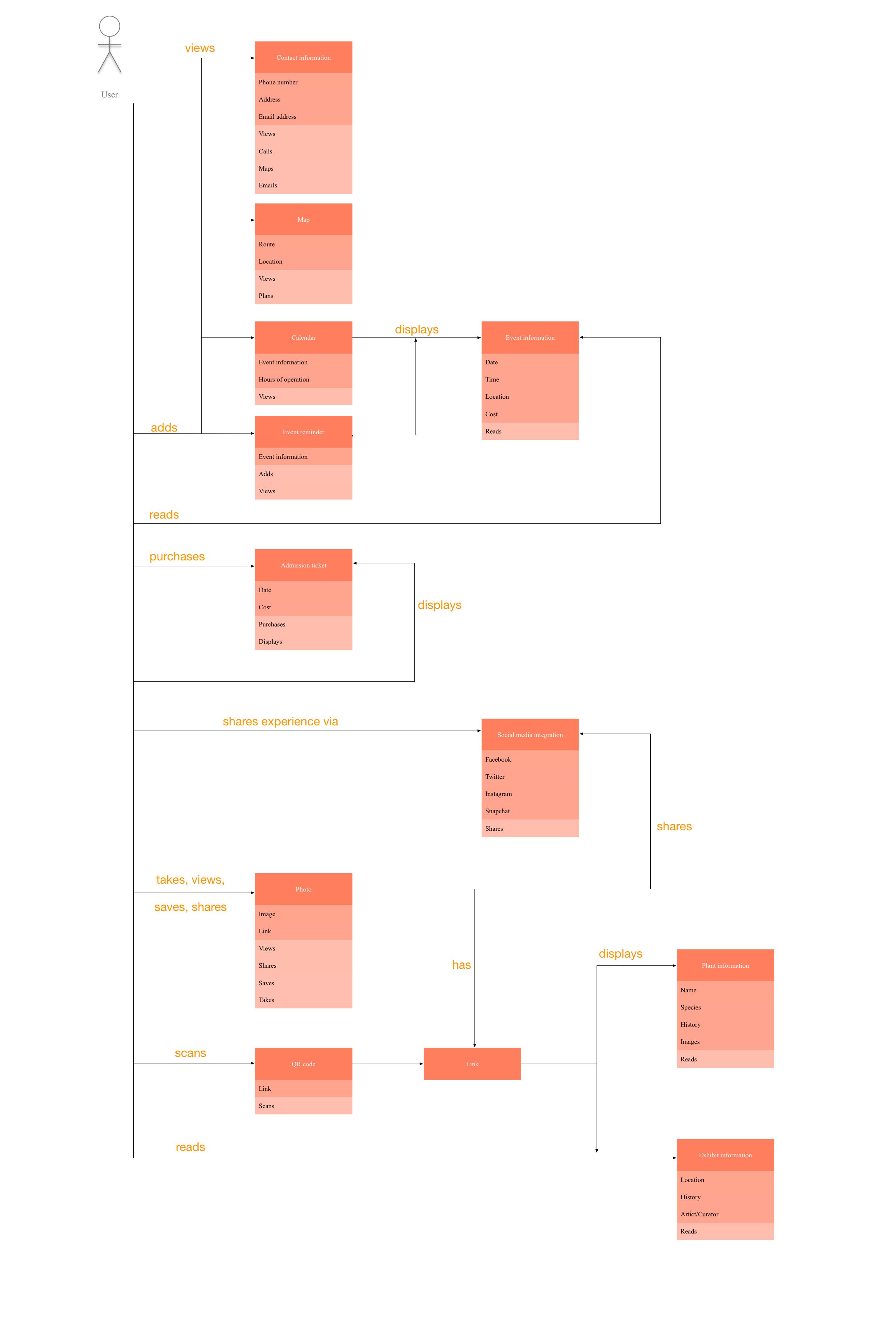
We used conceptual model -- which may be thought of as the "ideal" mental model of the function of the application -- to describe the concepts that a person using the tool will be able to manipulate.
We used 12 cards to compose the conceptual model, each card contains concept, attributes and operations, the relationships between concepts are also demonstrated.
Requirements
From here, we were able to generate initial requirements for the 5 major themes. We came up with a requirement list that we might cover in the futhure.
Ideate
So, what will our app look like? In ideate mode, we aim to generate radical design alternatives, describe what users can do with the product and ground the concepts needed to understand and interact with it.
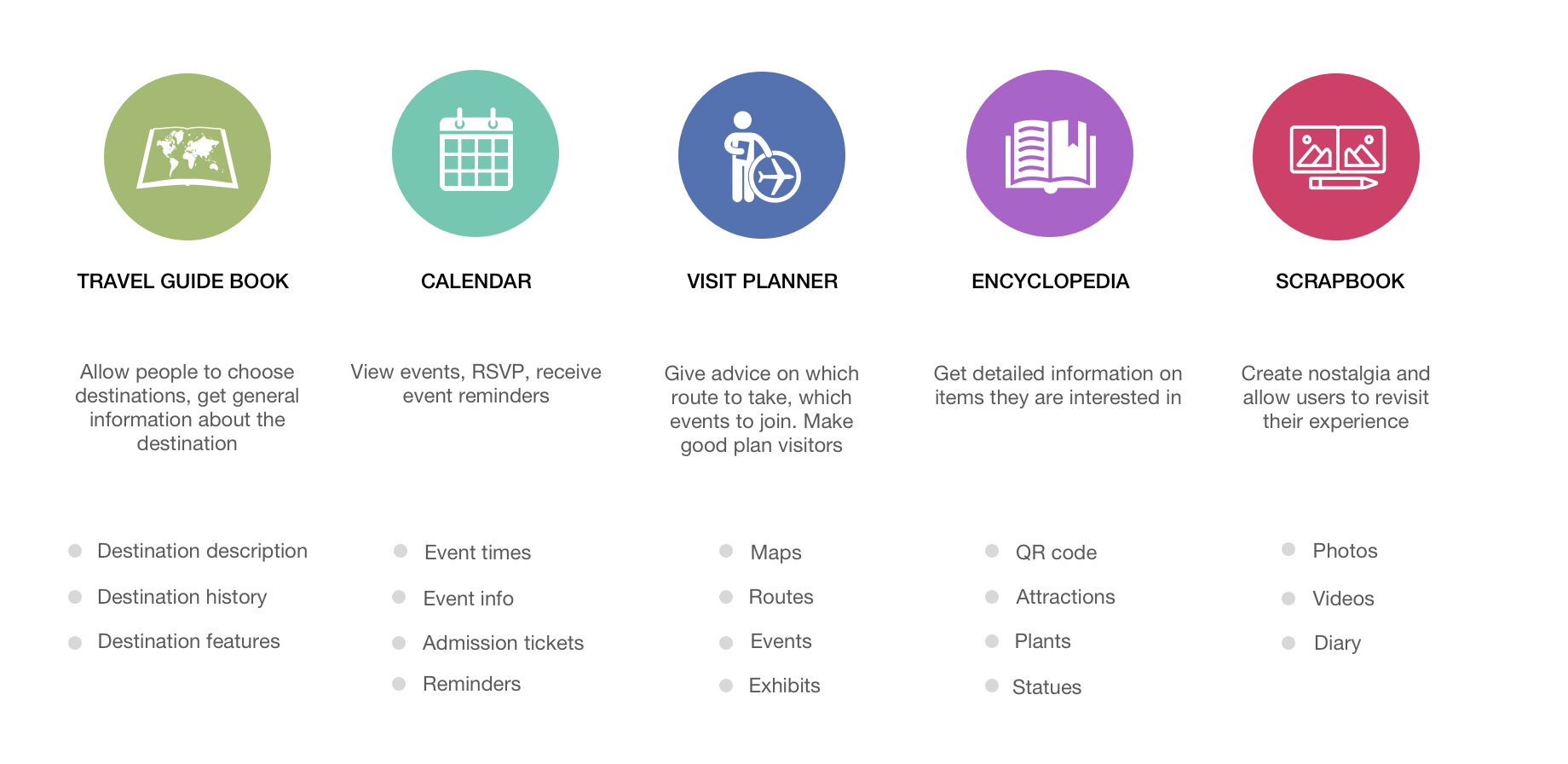
We first finalized the system concept statement and created conceptual task scenarios for the two user personas. Then we used 5 metaphors to envision the design,
the app will serve the users as a travel guide book, a calendar, a visit planner, en encyclopedia and a scrapbook. We chose 3 interaction types that people will use during their experience: exploring, manipulating, and instructing.
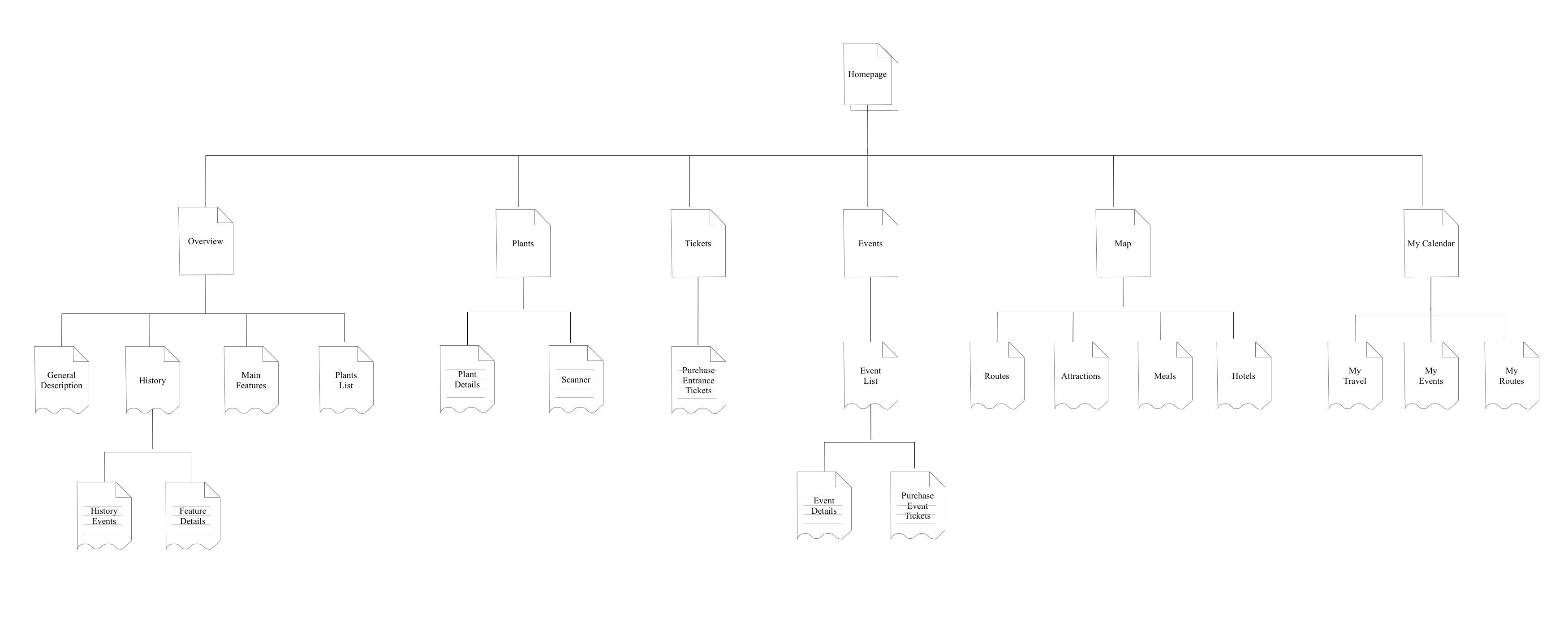
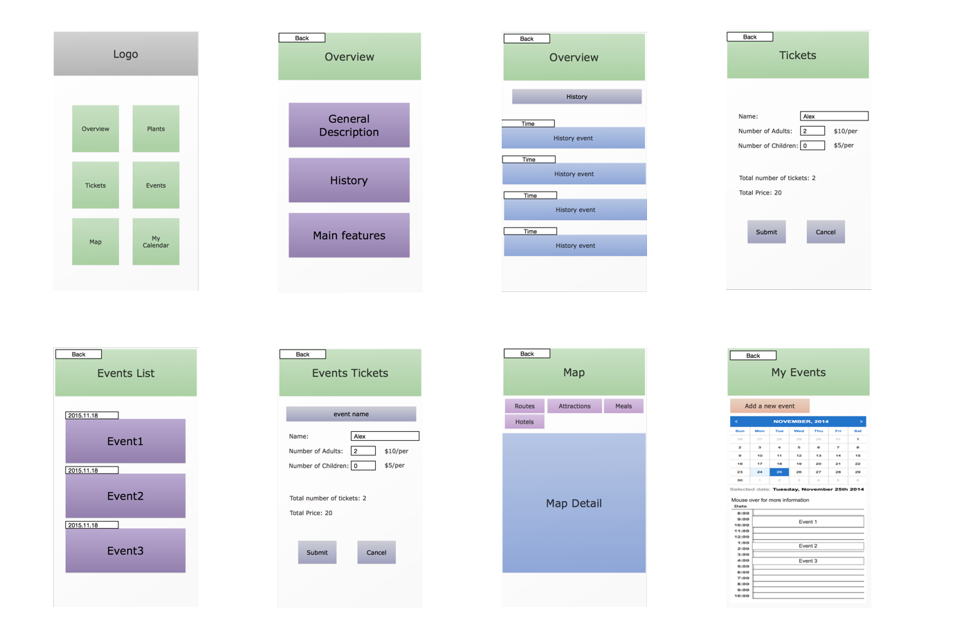
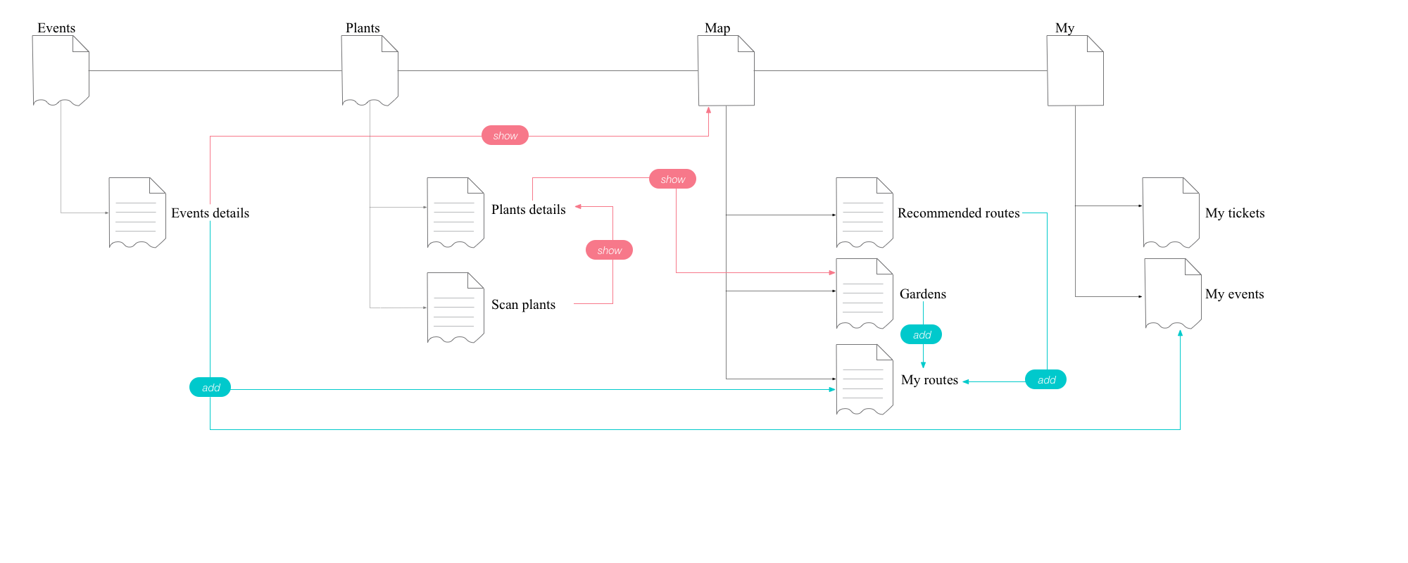
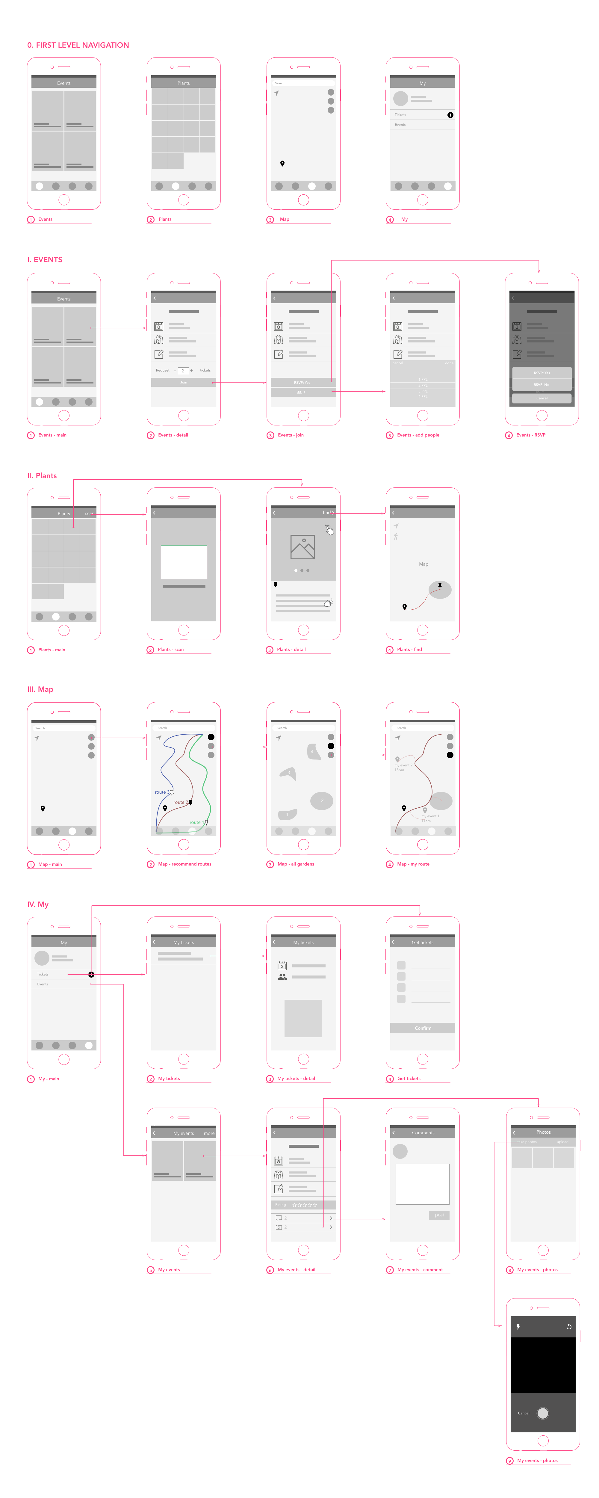
After performing a closed card sorting, the site map was generated to demonstrate the information architecture of the app. Finally, wireframes were
created to present a simplified view of what content will appear on each screen.
Metaphors
 Site Map
 Some Wireframe Screens
Prototype and Test
The deliverable of the first iteration was a navigable low-fidelity prototype made in Axure.
As a first iteration, this prototype only covered 2 of the 5 themes: plants and events.
We tested this prototype with 8 users and gathered empirical information and used it as input to downstream design iterations.
Iterate
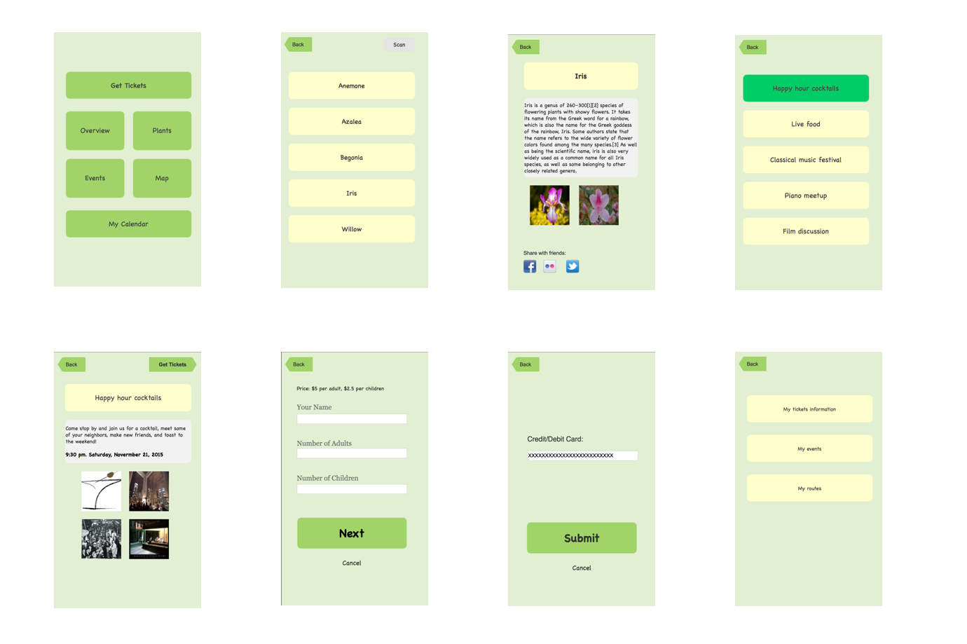
We then redesigned our prototype with the findings from the test, and moved on to create the high fidelity prototype.
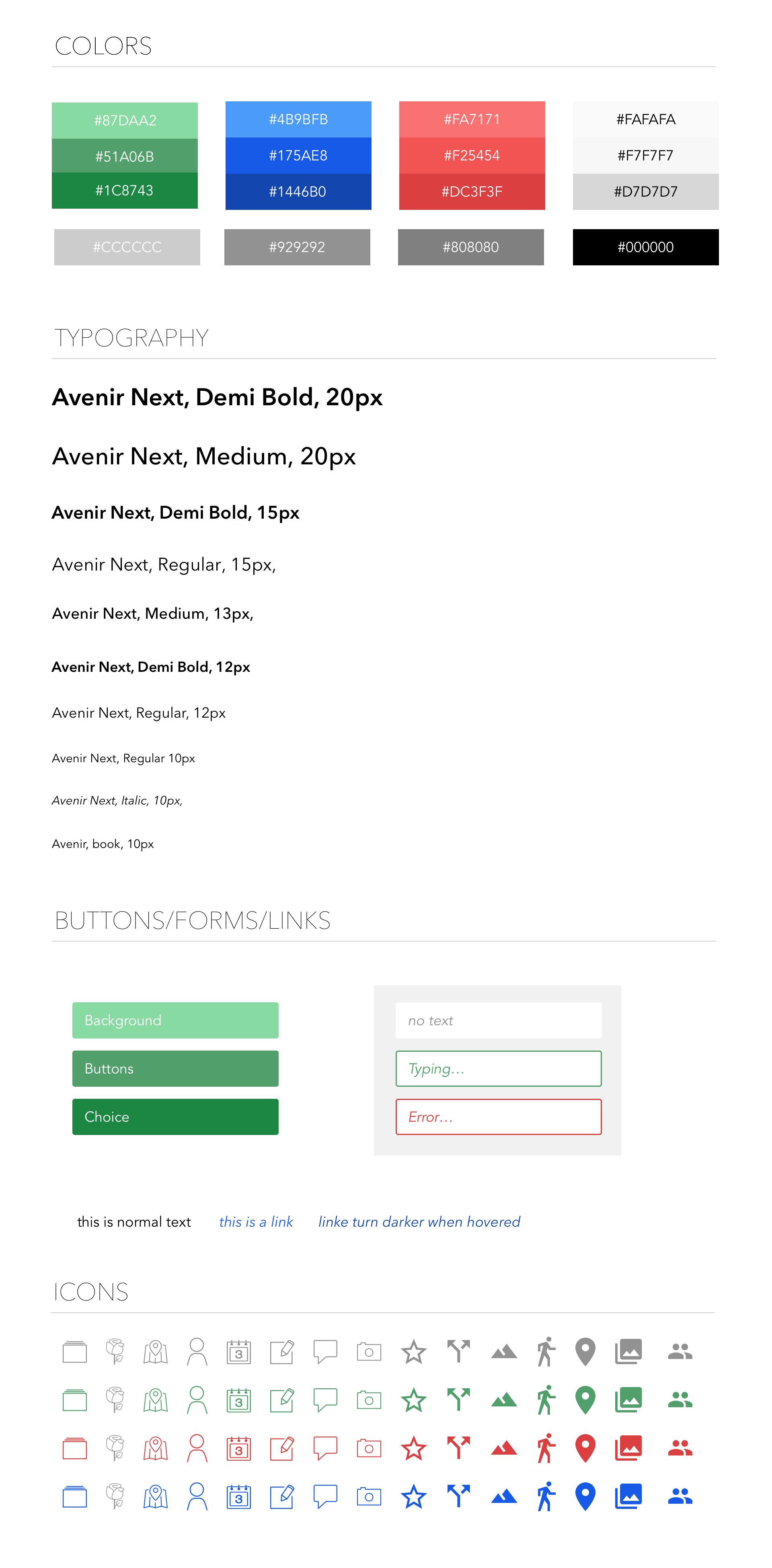
Following the process, we updated the sitemap, we also made a styleguide to set the standards of the final design.
Some Updates
- We found people wanted to gain more information in the event list such as the time, the topic, the location so that they can choose directly which ones fit their agenda without clicking into it. Thus we changed the layout of the event list and instead, we used the card layout to show all the events, through this way we could display more information in the event screen.
- Updated the event feature, people can upload their photos to the app and share with the ones who participated in the same event with him.
- We used a global navigation bar at the bottom, so users can navigate without going to home screen.
- Added the map feature, people can see the recommended tour routes, spots.
Site Map Update
 Style Guide
 Wireframes
 Visuals
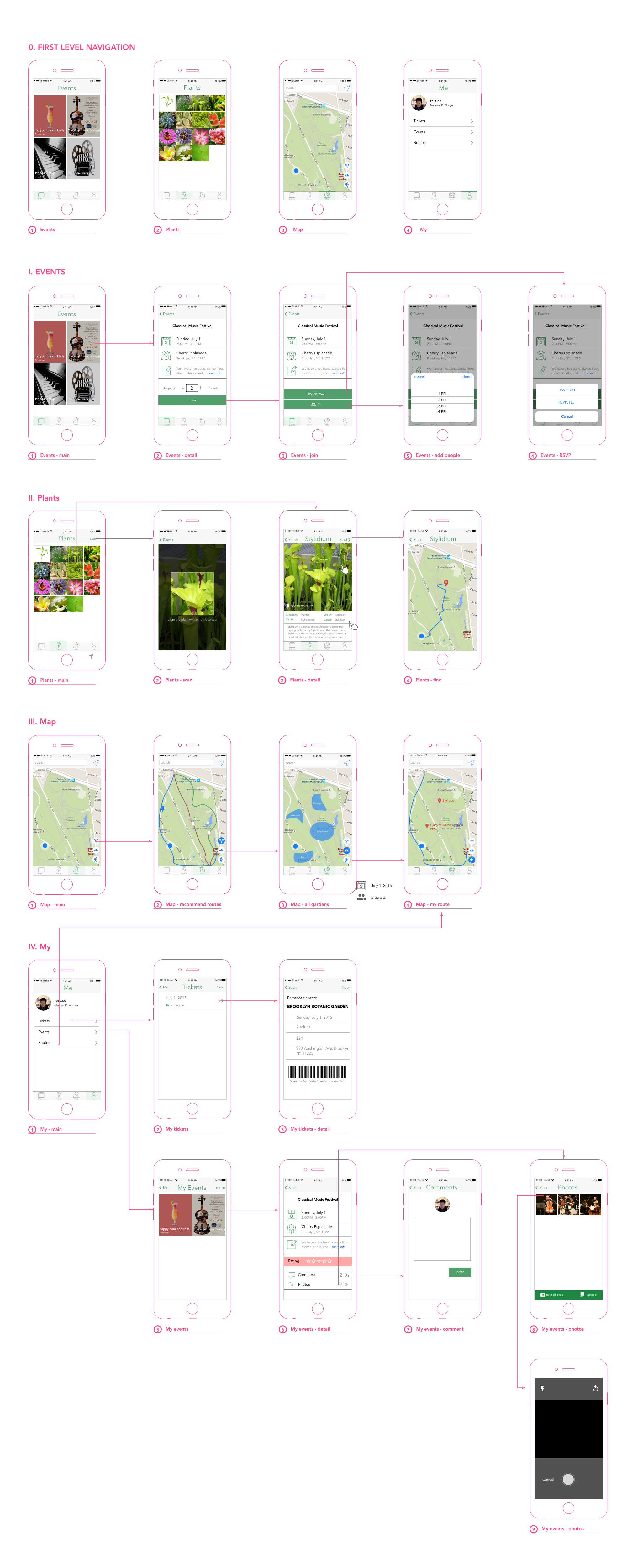 Prototype