Team: Fei Gao, Messer David, Yawen Wang, Russo Matthew
Tools: Sketch, Axure, Omnigraffle, Proto.io, After Effects
Topic: Class Project -- Prototyping and Implementation
Personal Contribution:
- participated in interviews and sketching
- independently conducted competitive analysis and conceptual design
- participated in testing for low-fi prototype i1
- independently designed low-fi prototype i2
- participantd in the creation of hi-fi prototype
The Problem
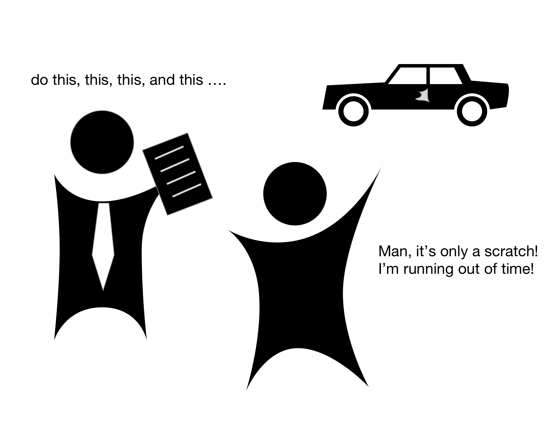
Imagine you're going to spend your weekend with you family. You ride your cars to your destination. At a crossroad you're rear-ended by another driver.
So you stop, check the damage and find there's only a small scratch. You talk with the driver who seems very sorry. Then you call the insurance company and
the police, you go back to your car and appease your family. 20 minutes later, the agent and the policeman come, you spend another hour to go through
everything before you're allowed to leave the scene. By the time you arrive at your destination you're two hours late, everyone in your family seems unpleased by this unexpected minor accident.
Do you want a small scratch to ruin your holiday? Of course not.
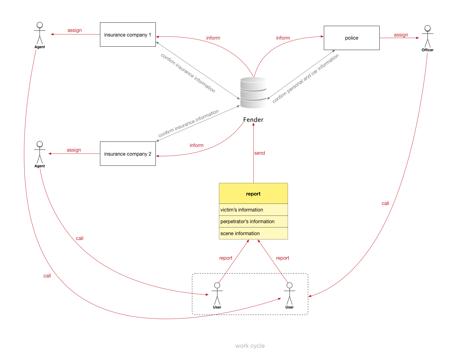
We believe it's redicilous to go through so many haunting steps to deal with only a scratch in our car, and that's why we designed Fender,
an app that helps drivers to deal with minor car accidents with ease and convenience.
In this project, the major problem that we dealt with was that how to make sure users can go through as few steps as possible to generate
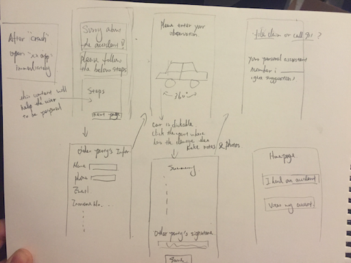
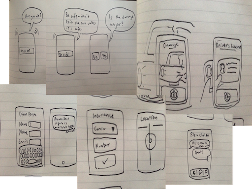
an accident report which is comprehensive to third parties (insurance company, policeman). We talked with some drivers, brainstormed ideas,
conducted competitive analysis, performed conceptual design, and went through several iterations of prototypes and finally came to the solution.
Understanding Users
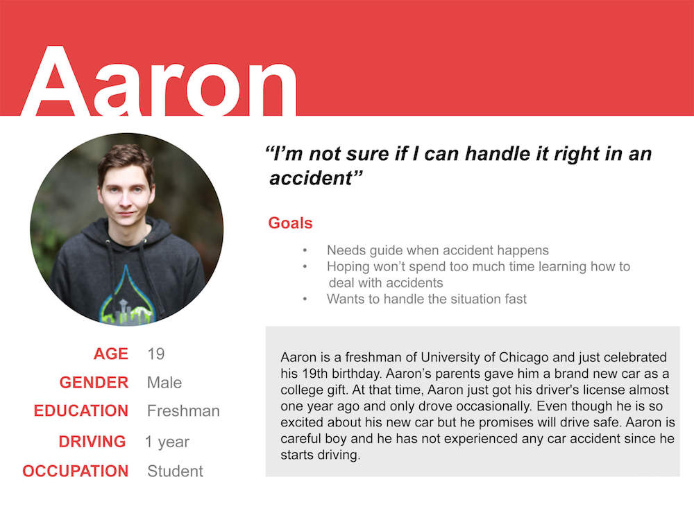
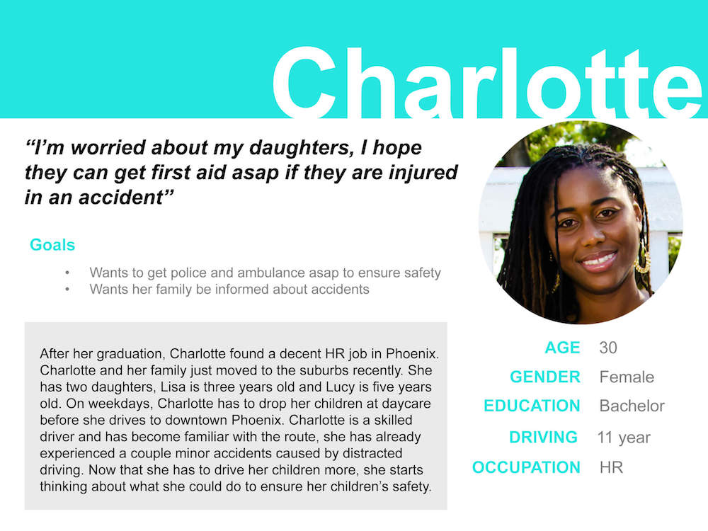
Personas
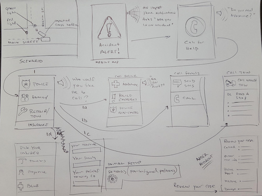
Scenario
1. It’s Tuesday morning and Aaron is driving his new car to class when he is rear ended at an intersection.(the environment)2. Aaron feels anxiety and nervous. He is in the center of the traffic and this is the first time he encounters such situation.(the user’s emotion)
3. He opens the accident assistance application and seeks for help.(the motivation)
4. As suggested, Aaron calls the police first.(steps)
5. Then, he walks out his car and begins to exchange information with the other driver, he enters his name, email address, phone number, etc. in the application, and takes a photo of his driver’s licence.
6. Aaron then enters the car information and takes pictures of the scene.
7. After all these are done, he sends a notification to his insurance company about the accident. Then they wait for the police to come.
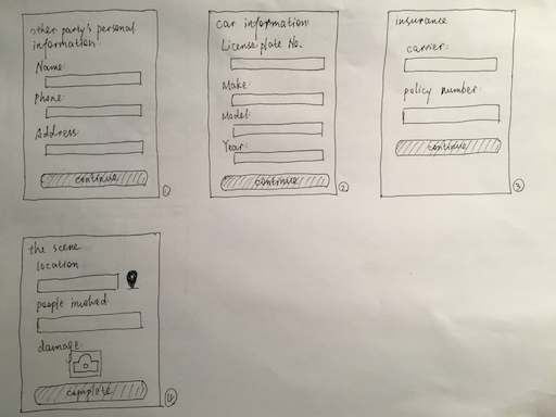
Sketches
Competitive Analysis
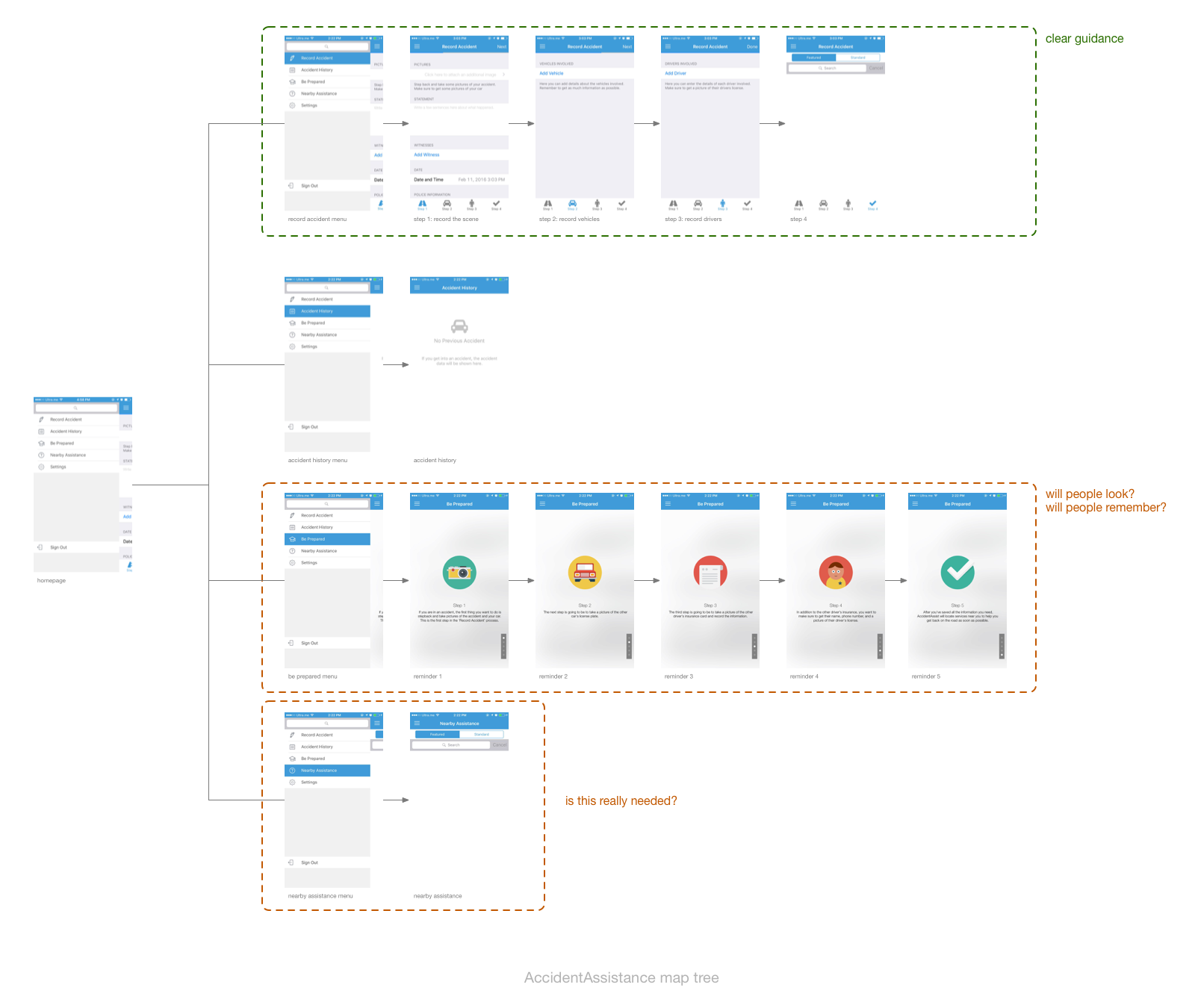
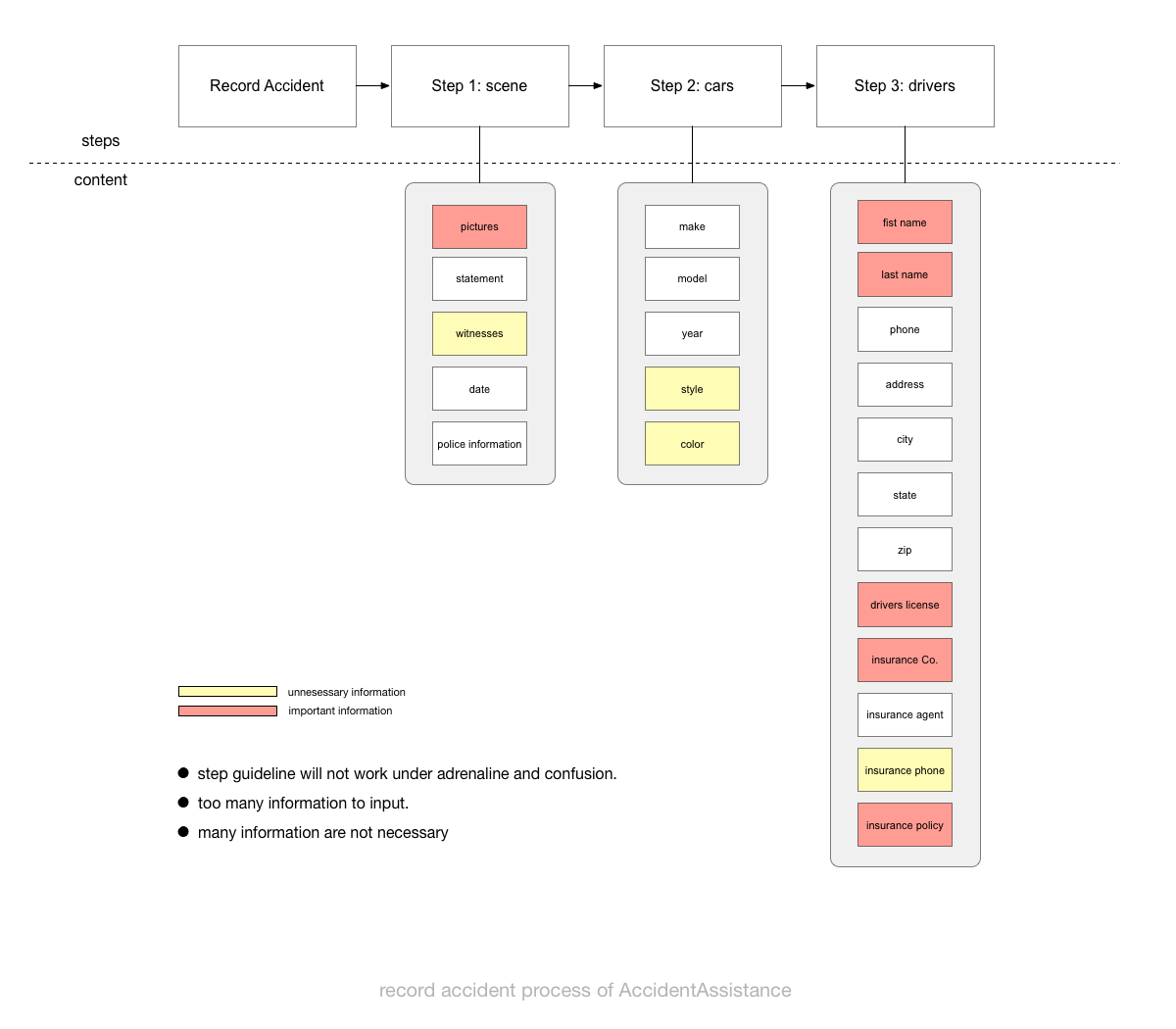
In the next step I conducted competitive analysis to find out the success and failure of similar apps. I studied AccidentAssistance and broke down its information architecture, that's when I realized this dilemma: car accident is an information-sensitive topic, a lot of information should be covered (e.g. the drivers, the cars, the scene), but under the context of "accident" where people are under adrenaline and confusion, entering too much information will make people exhausted. So how can we deal with this situation?
Conceptual Design
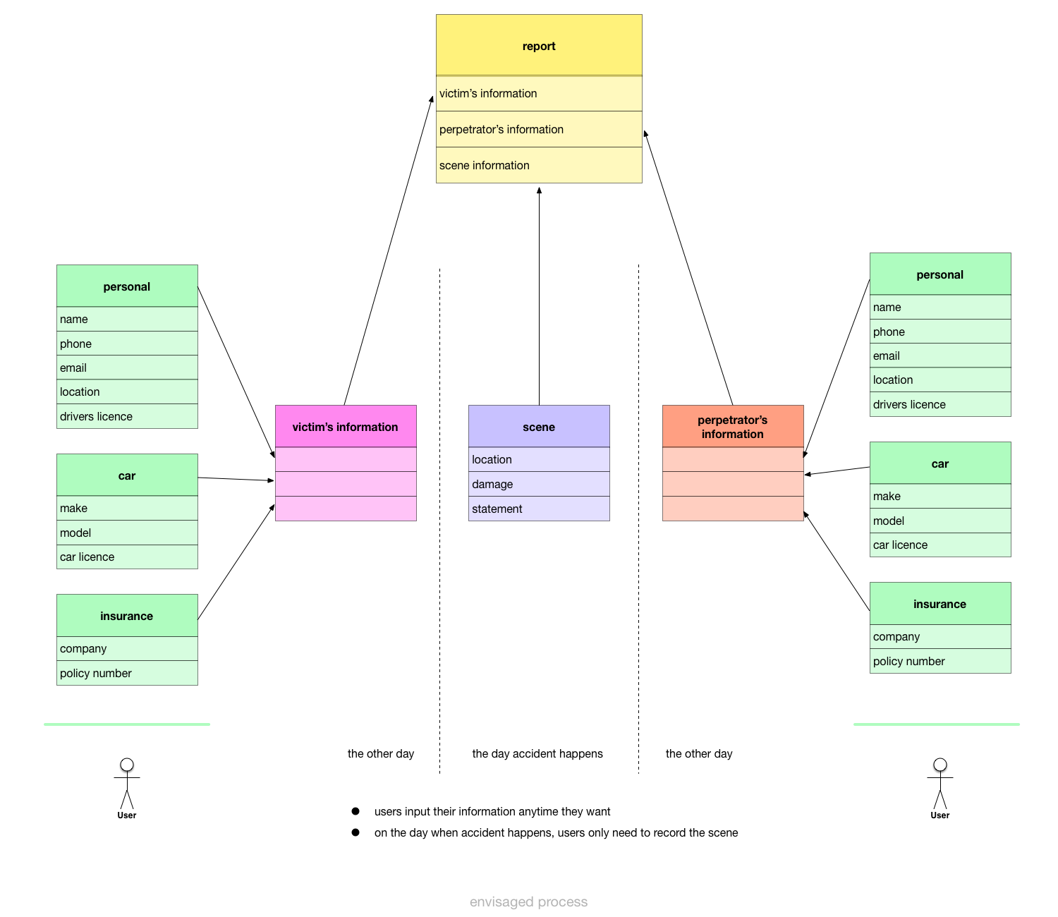
I first tried to solve this problem in the conceptual design phase, I considered how should the system deal with these accidents, how to allow users to generate comprehensive reports with as little information as possible, and how should users perform the task when using the app.
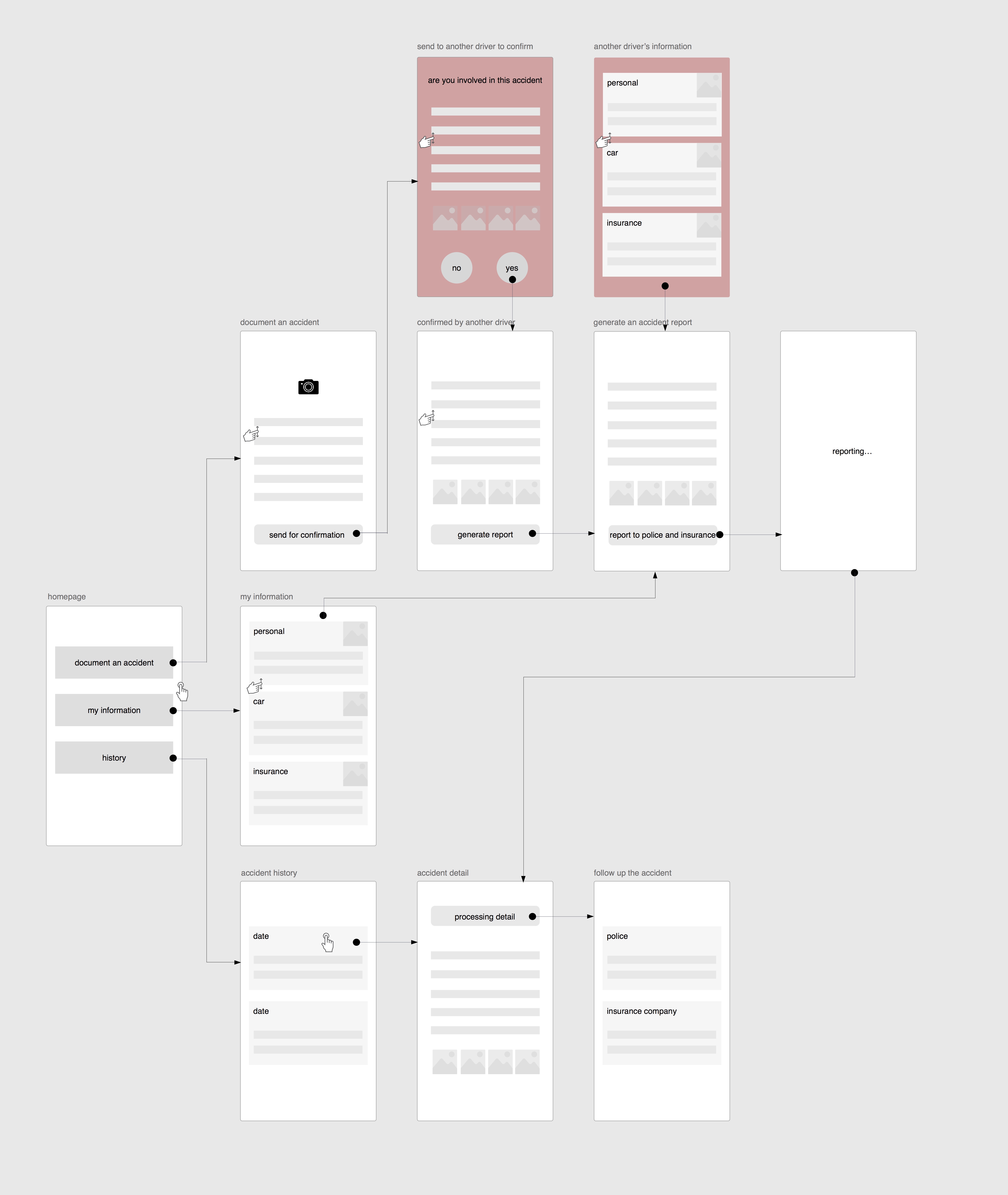
Driver information(green):
- 5 keys for users' personal information
- 3 keys for cars' information
- 2 keys for insurance information
- 3 keys for accident information
In our concept, data are entered asynchronously, for exmaple, users can enter their driver, car, and insurance information once they download the app, thus, when they're in an accident, they only need enter the accident information, which only includes the location, damage and statement. Through this asynchronous way, we made sure that users will only need to enter a little information in an accident, but the final accident report is still comprehensive.
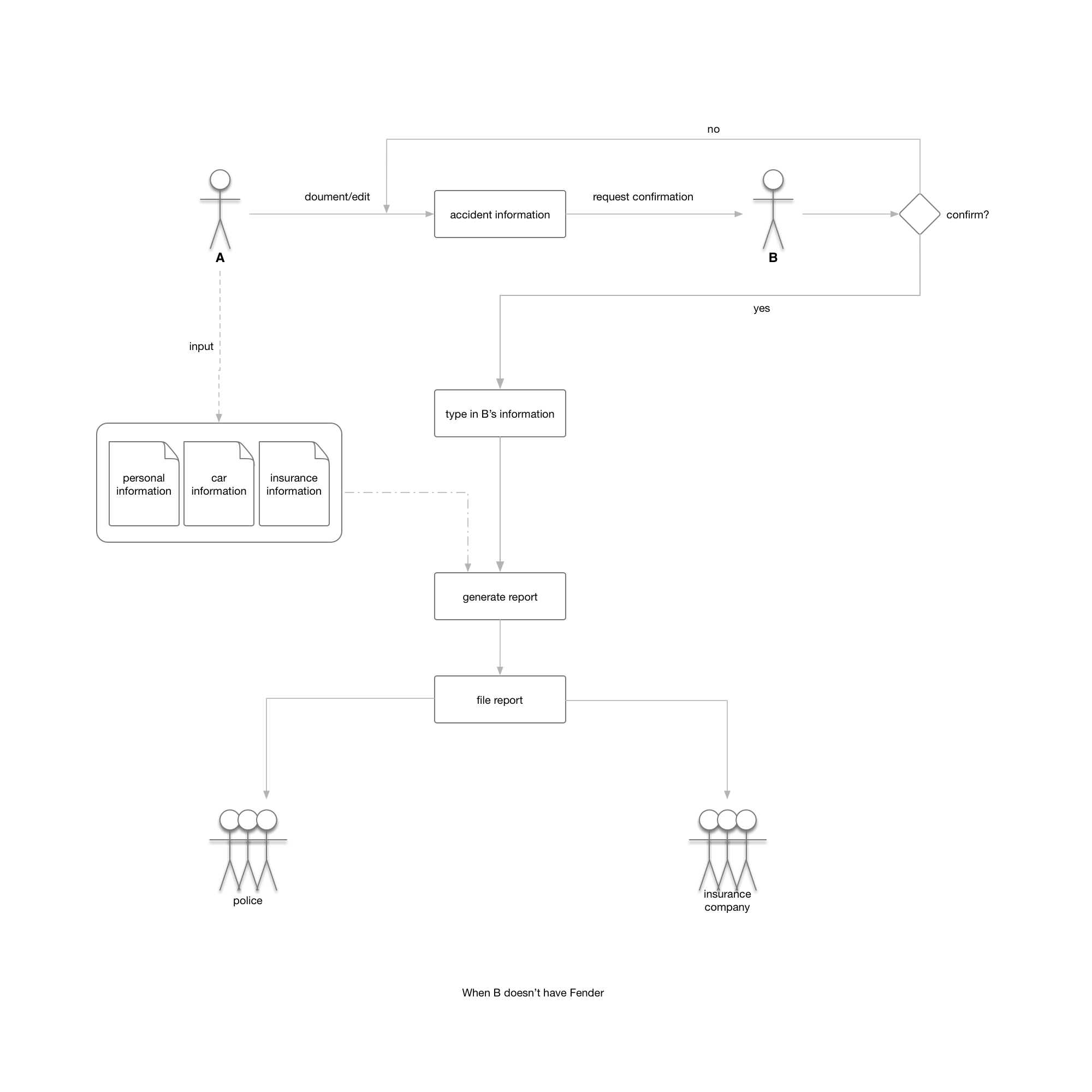
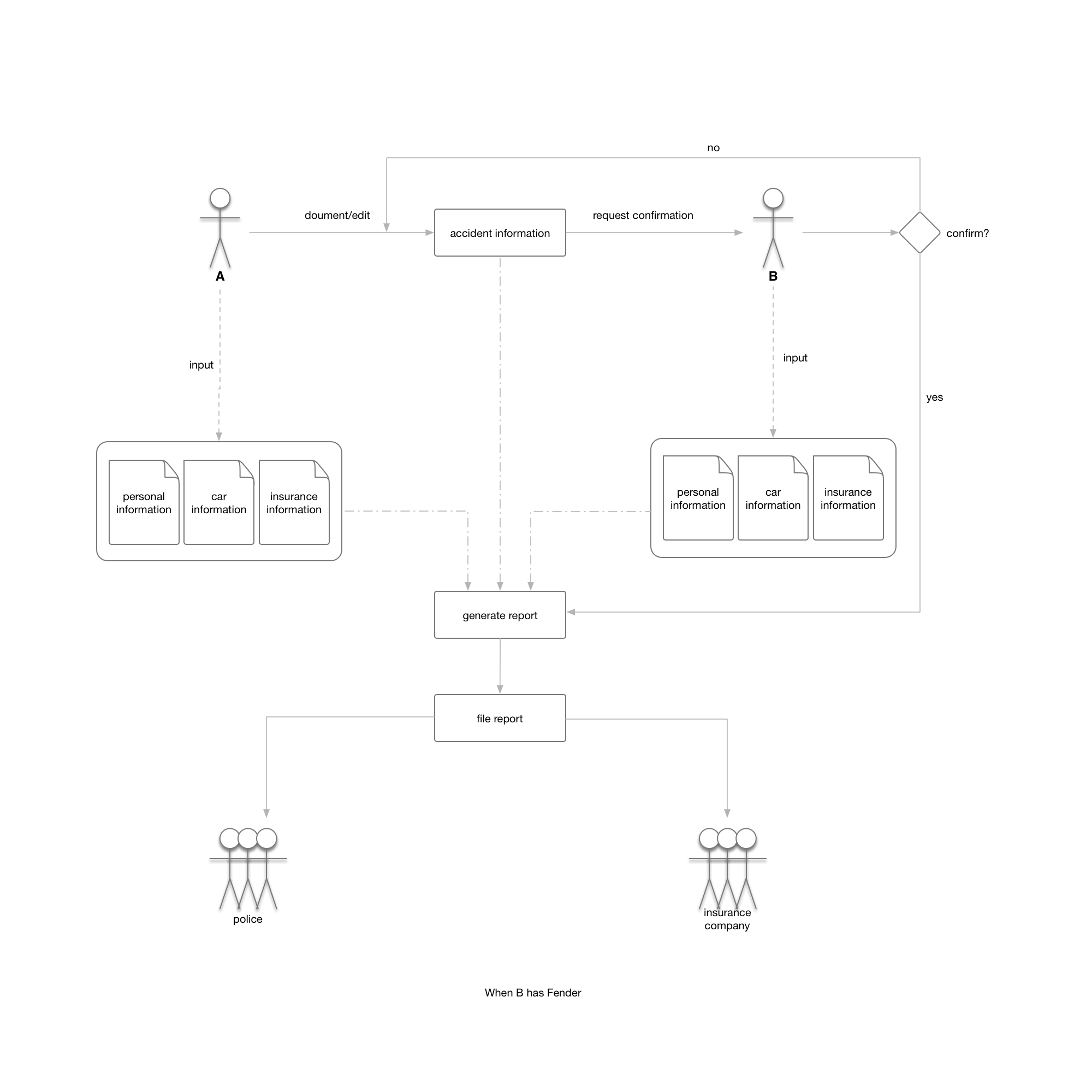
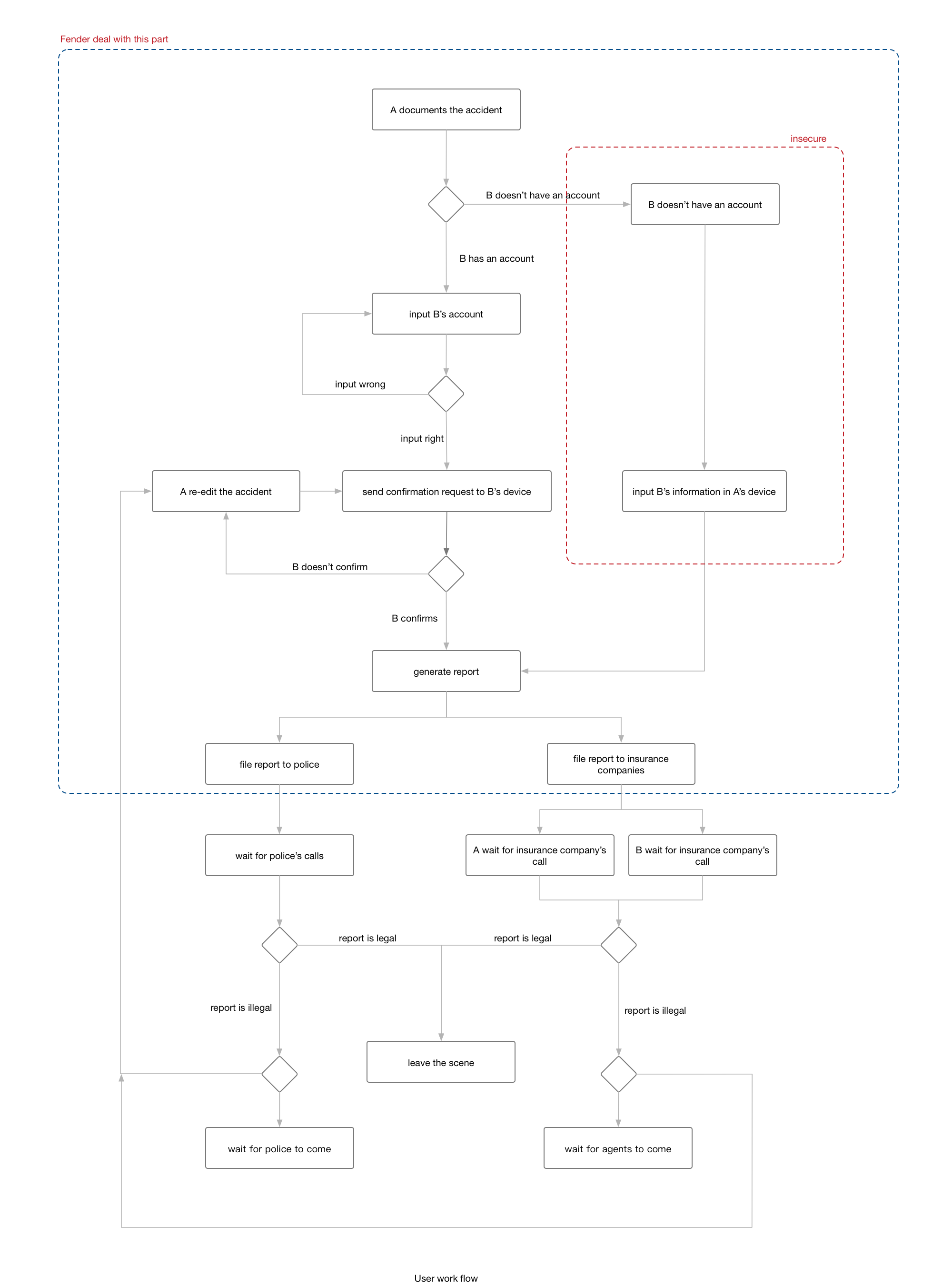
We established the flow charts to demonstrate how people use our app:
Low-fidelity Prototype -- Iteration 1
In order to quickly test assumptions and ideas before moving forward to the contents, design or interactions, we made our first low-fi prototype within one day and tested it with three users, we wanted to gain feedbacks on the features and the navigations of our app and see if it's something that people would like to use. Here are some key takeaways.
Key Takeaways:
- We only had a hamburger menu in the navigation bar, and there was no "back" button, users had to finish their task once at a time, which made most of them exhausted.
- In the prototype, users had to go through several informational screens and make some choices before they could finally report their accident, but we found that they wanted to be able to report the accident in an expedited manner.
- Users wanted to check their claim status.
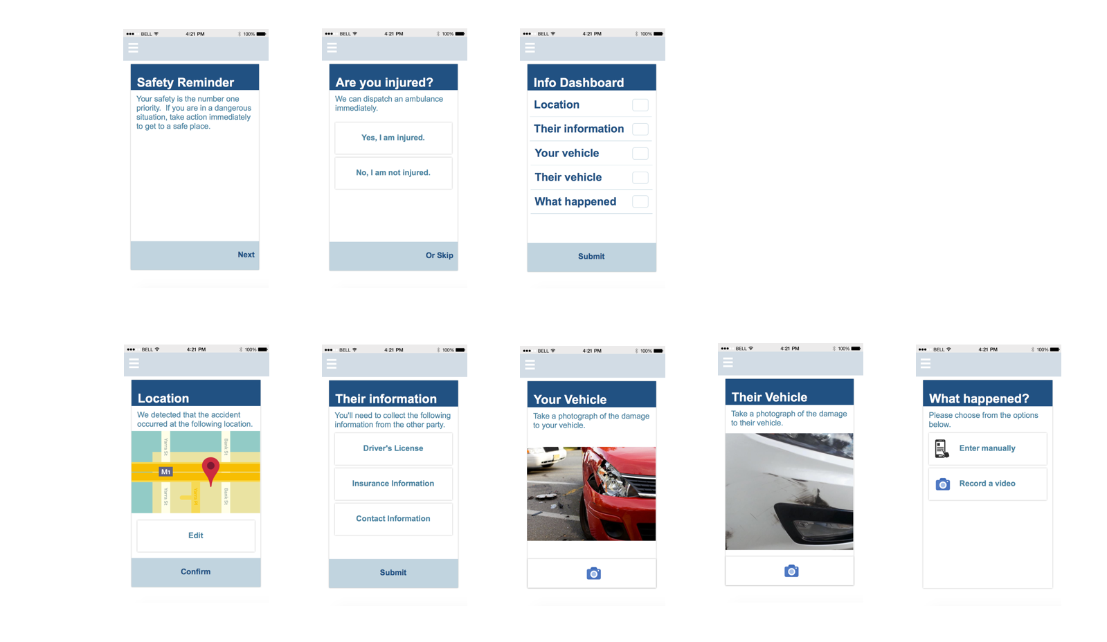
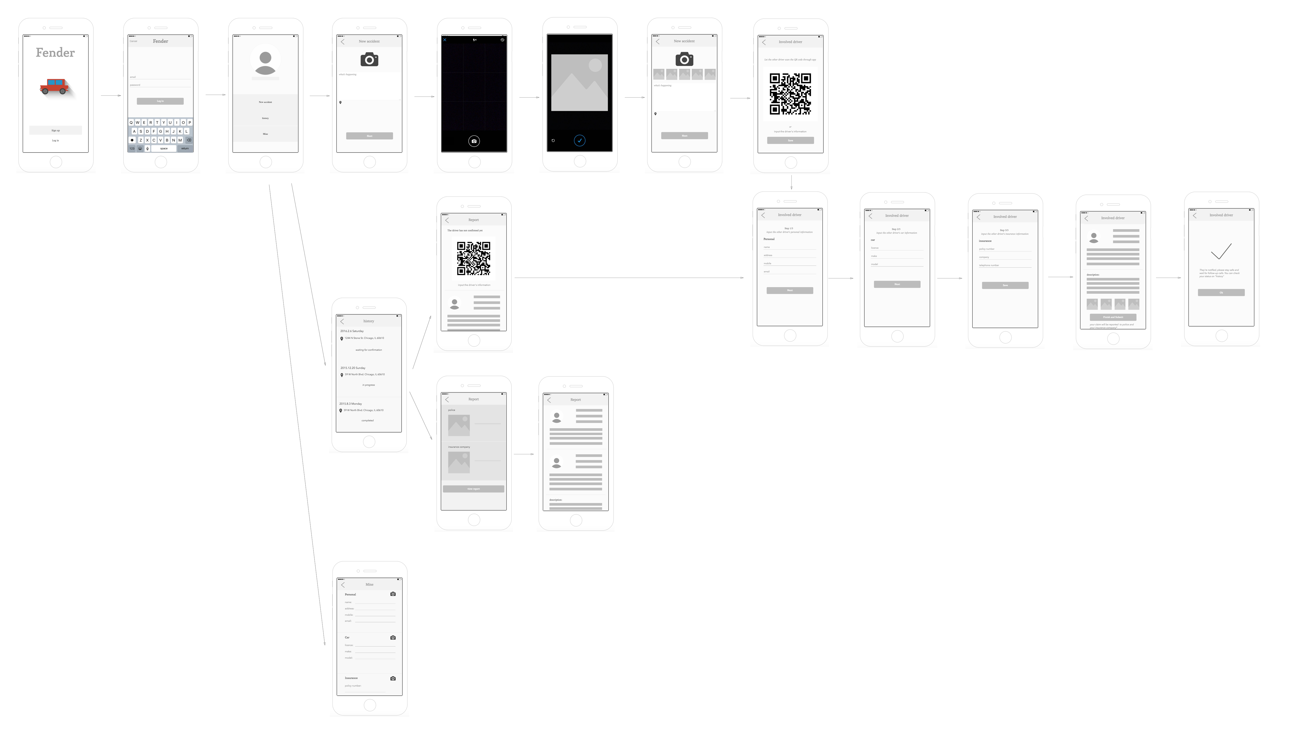
Here are some screens from this prototype:
Low-fidelity Prototype -- Iteration 2
With the findings in our first test, we redesigned our prototype and did a second round test. Here are the key updates and key takeaways.
Key Updates:
- Since people want to report the accident quickly, we deleted all the informational screens prior to reporting the accident. Instead, we used a step by step process, users will only need to to through three steps to report the accident.
- To further speed up the data gathering process, we implemented QR code to allow users to get the other drivers' information quickly.
- With the simplification of the process, we deleted the hamburger menu and update the navigation.
- We added a "history" feature for people to check their claim status.
Tradeoffs:
As shown in the user flow, for security reasons, we intended to have a "confirmation" phase, for example, after one driver generates an accident report, the report will first go
to the other driver and ask for confirmation, the report won't be sent to police and insurance company unless it's confirmed.
However, this design will probably have several problems: what if the other driver doesn't have Fender in his phone? what if they're in an area where connection
to internet is not so good? what will be percentage of the fraud reports?
We thought the user experience of the app shouldn't be affected by a few fraud reports, and that's when the idea of QR code came into our mind: scanning the QR code not only
get the other drivers' information, it's also a "confirmation" action. It not only simplifies the process, but also ensures security.
Key Takeaways:
- In this interation, people can better navigate through each screens when recording accidents, but some of them stated that initially they were overwhelmed by the "next" buttons and thought they should go through many steps.
- Some people also declared their concerns on how to track the process status of their accidents, they stated a need of transparency.
High-fidelity Prototype -- Iteration 3
Through our talk with our participants, we actually realized that people's emotion (anxiety, worried, etc.) when engaged in an accident is a big issue that can't be ignored, especially for new drivers. Although we tried to simplify the process of reporting an accident, we wanted to go further in this iteration so that they won't be bothered by all the steps.
Key Updates:
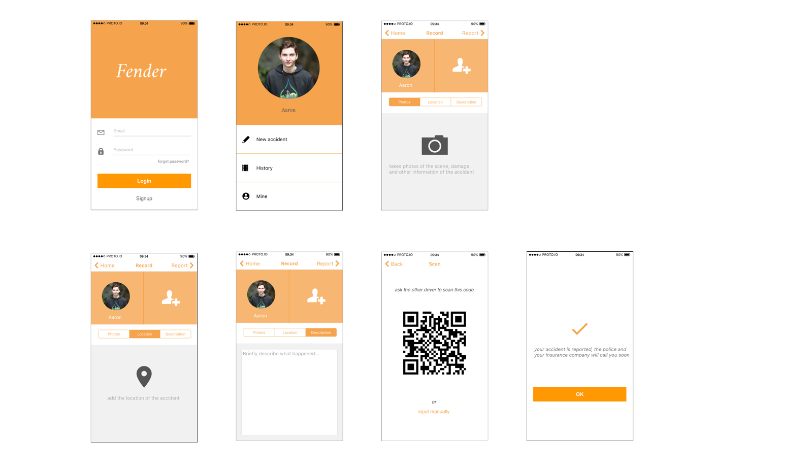
- To minimize users' mental load, we gave up the initial "step-by-step" design, instead, we used a segmented navigation bar to document "photos", "Location", "Description", We also moved the personal information to the top. Through this redesign, all information is displayed in the same screen which makes it straightforward for users.
- To increase the transparency of the status, We added the contact information of the agents and the policeman who are dealing with the accident, and designed a chatting room for all the people who are involved in the accident, thus people can follow-up with the process, which is helpful for not only the users, but also the agents and the police.
Here are some screens from hi-fi prototype:
Limitations
- The major limitation of this project is that we didn't have time to interview any people from third parties, e.g. insurance agents, policeman. Considering the nature of this project, we should definitely find out what their needs are for the accident reports.
- Another major limitation is that we only considered the situation in which only two drivers are included, what if there are more than two drivers in the accident?
- We also wanted to consider what should users do after they've reported the accident, do they just sit there and wait? how long that time period would be? How to reduce people's anxiety during the waiting time?
